Productivity App

As the new year begins, you've probably set your usual resolutions. One of them is likely to stop procrastinating and get to work, right? It definitely is for me. One thing that holds me back from achieving this goal is endlessly scrolling through social media, lost in autopilot, only to realize it's already nighttime.
The app concept I've been working on is designed to tackle this issue — it tracks the time spent on your phone and computer, showing you exactly where that time went and calculating your productivity throughout the day.
Design Process
When I start a project, I follow a routine and design process to ensure consistency in my work. No matter the type of project, I stick to these four key steps:
1. Research
2. Sketch & Wireframe
3. Moodboard & Resources
4. Design
Research
For the research phase, I already had a clear direction. The goal is to create an app that tracks the time you spend in other apps and calculates your productivity score. There’s already a similar app on the market called Rescue Time. I’ve used it before, and while the concept is great, the app feels outdated in terms of design, has UX flaws, and could definitely offer a better overall experience. This is what inspired me to create this concept, which could also be seen as a redesign of that app.
Some specific issues I found with the Rescue Time app include:
-
Poor information hierarchy on the homepage
-
Their charts are confusing, and there’s no option to select a period (week, month)—only a specific date for the overview
-
Top activities are only categorized, so you can't see how much time you’ve spent in a specific app
-
Despite a UI update, it still feels outdated and lacks modern design
-
You can’t set goals on mobile—this feature is only available on desktop

Rescue Time UI
Rescue Time offers both a mobile and desktop app, and while the desktop UX is better than the mobile version, I decided to focus specifically on redesigning the mobile experience for this project. However, I may revisit the desktop version and work on a redesign in the near future.
Now, let’s dive in and get to work! 🚀
I always begin by sketching on paper and jotting down notes. This allows me to quickly see if my ideas actually make sense without investing too much time into wireframing only to realize it won’t work. Surprisingly, pen and paper are still incredibly useful—even in 2024. Who would've thought?

Wireframes
Moodboard and Design
Exploring online and finding inspiration from other talented designers is crucial in my process. Dribbble is my go-to site, and I visit it daily to stay updated on the latest trends and gather ideas when starting new projects. I make sure to save every Dribbble shot I like and categorize them, so when I begin a new project, like this one, I can easily access and filter the designs that align with my vision and inspire me to create something great.
Once I’ve gathered a collection of designs that reflect the style I’m aiming for, I create a moodboard. This moodboard serves as a reference and a source of motivation throughout the project, especially when I feel stuck. I use InVision to create these moodboards—it’s an excellent tool for organizing and visualizing inspiration, and I highly recommend checking it out!

Moodboard for my Design
When I begin the design process, I start by selecting colors and a font that align with the moodboard I created. My goal was to strike a balance between seriousness and motivation. I wanted the app to feel professional yet engaging, with a hint of playfulness and that "game" factor to keep users interested. After experimenting with different combinations, I found that the typography and color scheme I chose work perfectly together to achieve that blend of focus and fun. The colors feel grounded, while the font adds a touch of energy—creating a design that feels both motivating and visually appealing.
Home Screen
The home screen was the most challenging to organize because it contains so much essential information for the user. It had to be clean, intuitive, and easy to read. During my research, I noticed that Rescue Time’s home screen wasn’t well-organized—it displayed a lot of information without a clear structure, which made it overwhelming. For this redesign, I wanted the user’s primary focus to be at the top of the screen. Since I’m not a fan of dashboard screens cluttered with irrelevant information and charts, I decided to split this screen into two sections—Overview and Detailed.
The Overview section is a simple, streamlined page that shows the most important data: the total time tracked for the selected period (whether it’s today or another day), the percentage change from yesterday, and a breakdown of how much of the time logged is productive versus unproductive. Additionally, there’s a productivity score that compares the productive vs. unproductive time and provides a brief message reflecting your performance. The second half of the screen highlights the time spent across different app categories, and it includes a navigation tab bar for easy access to other parts of the app.
In the Detailed view, you get all the information from the Overview, but with added depth. This includes a graph that shows your productive vs. unproductive time tracked per hour, day, or week, depending on your selected timeframe. You also get a "Time Milestones" card, which tracks your progress and displays data from when you first started using the app, giving you a sense of achievement as you see how far you’ve come. This way, users can dive deeper into their productivity trends while keeping the home screen clean and digestible

Home activity screen
Calendar
By tapping on the calendar icon, you’re taken to the calendar page, where you can select a custom date or period, giving you more flexibility than just the usual "today," "this week," or "this month" filters. A standout feature of the calendar is that it offers a quick overview below each date, showing how productive or unproductive you were on that specific day. This provides a nice snapshot of your progress, making it easy to track your productivity trends over time. I think this feature is a great way to stay motivated, as it visually reinforces your achievements and helps you identify areas for improvement in a simple, accessible way. It adds an extra layer of insight that feels both practical and encouraging.

Activities
The Activities page lets you see the exact time spent in a specific category or app, depending on which tab you choose at the top of the screen. When you select the Category tab, the app displays a list of categories along with the time spent in each. Tapping on a category expands the view to show all the apps within that category and the time spent on each.
Alternatively, if you choose the Apps tab, the page shows only the individual apps you’ve used, with time information sorted from most to least used, regardless of category. This provides a more focused view of your app usage.
Calendar screen

Activities tracker
Goals
The Goals feature allows you to set specific targets you want to achieve and track your progress within the app. Adding a goal is straightforward: you begin by defining the goal at the top of the screen, such as spending more or less time in a particular app or category. You can also customize the goal by selecting whether it’s a daily, weekly, or monthly target, how long you want the goal to last, or if you prefer to delete it manually when you no longer need it. Additionally, you can set up alerts to help you stay on track and reach your goal.
Once your goal is set, you can view it on the Goals page. This page displays how much time you've spent using the app within the chosen time frame, along with the option to delete, edit, or view more detailed statistics by clicking the “more” button. This feature gives you a clear overview of your progress, making it easier to stay focused and adjust your goals as needed. Whether you’re tracking daily usage or long-term habits, this tool helps you stay motivated and accountable.
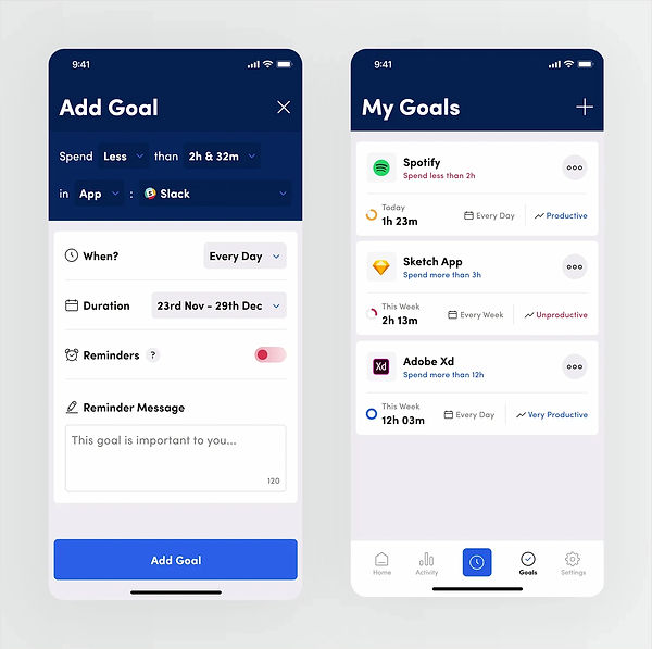
Goals feature
Review
Since this is just a concept project and there aren’t many screens designed yet, it didn’t seem practical to conduct user testing at this stage. Instead, I’d love to hear your thoughts on the project! Do you like the final result? What flaws do you notice, and what would you change or add to improve it?